

Crocuses, cozy reds and a little cottage
Crocuses, cozy reds and a little cottage
Week 8 of my visual journals

Hello!
I often get asked what helps to create these weekly visual journal spreads. This single sketchbook is gradually getting filled up and is becoming very precious. It is already giving me so much joy and sitting down each Friday to draw these spreads is quickly becoming a discipline I look forward to and wouldn’t want to stop.
Here are a few pointers which I’ve found make the process super enjoyable and hopefully can inspire you if you’re keen to get started or would appreciate a tiny bit of encouragement to keep going.
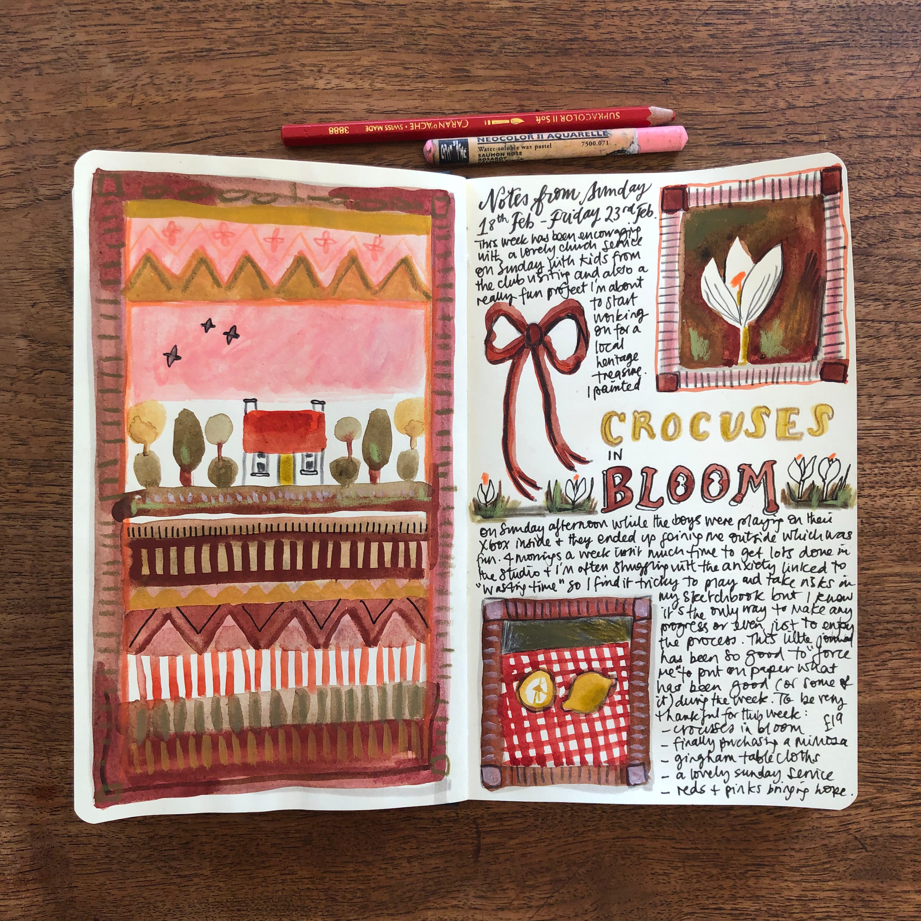
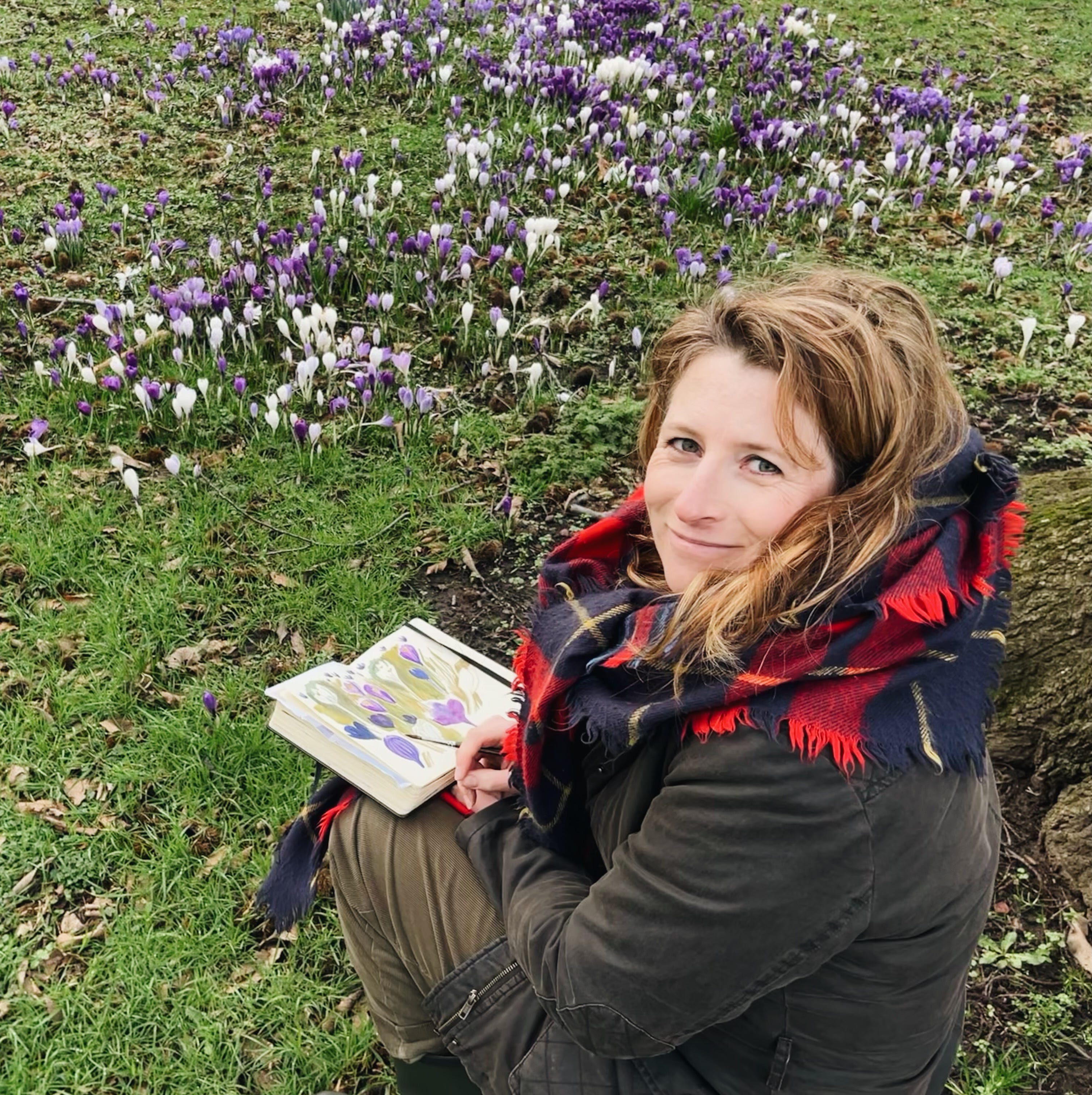
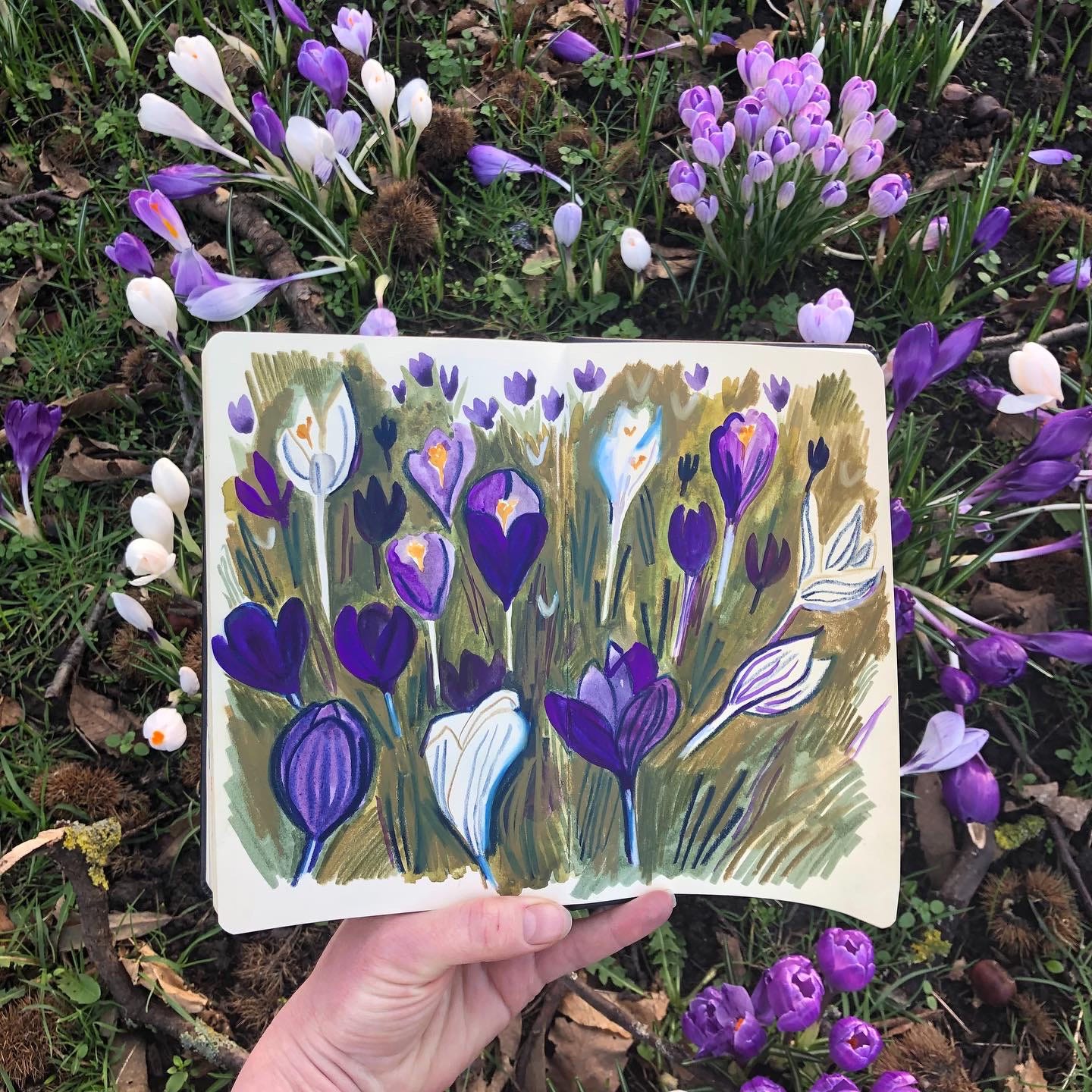
When the weekend comes and I sit down to draw my weekly visual journal, my other “play sketchbooks” come in handy to remind me of what has visually caught my attention throughout the week. For this to work, I need my sketchbook on me at all times and I’m ready to sketch as soon as an opportunity arises. That means having a pencil or a few select pens on hand. I have a sketchbook in my bag for location drawing and I also keep one in our living room, for evening sketching. In the past I would have also used my iPhone to capture moments and then draw them but this year since I’m using my phone to film the process, I need other strategies - which is great because this is pushing me to draw more on location and from memory. For example, the crocuses next to our house are currently in full glory and on Sunday I took a bit of time to get out to paint them in my sketchbook. I really enjoyed focusing on the negative space with different shades of green. So I knew that I would somehow include crocuses in this week’s spread.
I find that having kept a word journal all week also helps me to quickly remind myself which words or thoughts stand out. This clarity can be great for lettering purposes. This week my big words are “crocuses in bloom”. Journaling with words (morning pages type/prayer journal/diary whatever is best) also helps to know what I’ve been up to, what I’m thankful for and how much I want to put on paper (again).
Throughout the week, I also take note of colour palettes which I’m drawn towards. That can be on my daily walks, in our interiors, in books, movies or on social media. This week, I’ve undeniably been drawn to pinks and reds and have enjoyed noticing the many hues they offer, whether in some of our red enamel mugs, in our gingham tablecloth in the dining room, or in the details of the vintage tins on my studio desk which I bought in French antique markets a few years back. I wanted this little colour obsession to be reflected in my palette this week. So when the time comes to draw and paint my visual journal, I’ve already selected some key materials to make the process easy and straightforward.
Lastly, I also love to draw from memory and create my own little world using a combination of ingredients from the past week but also prior to that with things I’ve visually picked up and stored into my brain from previous moments of my life. This week, on my left page I’m referring back to an old sampler layout which I’ve loved drawing over the past few years after having seen a mind-blowing exhibition at a museum in Edinburgh called Embroidered Stories: Scottish Samplers.
I hope this has been helpful and I would love to hear if you also have any tips to share. There are probably some I’ve forgotten but I think these are the main ones at this stage. They may change over time.
Here are the process videos for this week’s visual journal spread. This week I’ve used a mix of watercolours, gouache, pencils and ink pens.
Hope you’ve had a good week wherever you are. Springtime is definitely on its way here in Yorkshire.
Lovely as always. Thank you for letting us into your process as well!
I love your crocus sketchbook spread and your journal pages are beautiful! Love the colour combo.x